Shipped
Gemius
Design that brings order to complexity

Smart forecasts for better climbing
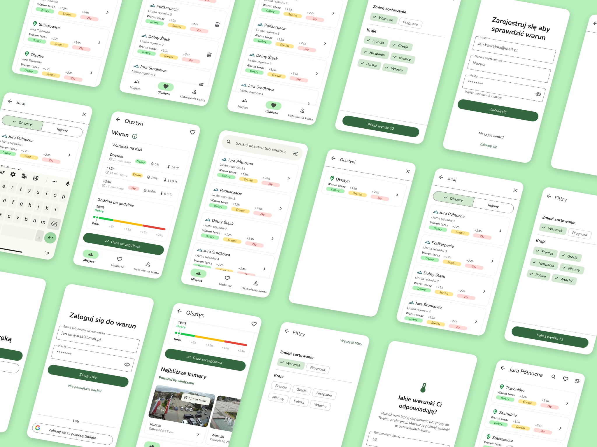
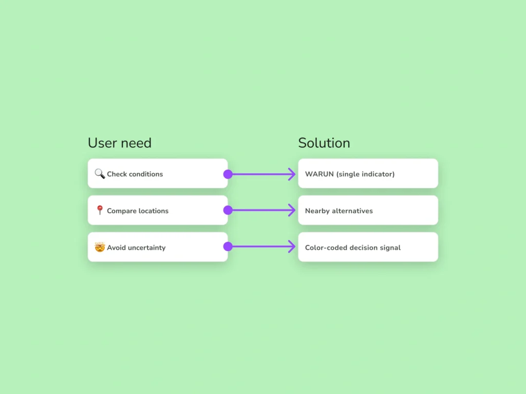
Warun is a mobile application that predicts climbing conditions at rock crags using real-time weather data. Instead of displaying raw metrics like temperature or rainfall, the app calculates and presents a simplified climbing condition indicator — the “warun” — based on factors such as humidity, sun exposure, and wind.
The goal is to help climbers quickly understand whether conditions are suitable for climbing, where they are most favorable, and whether there is a realistic chance for a session — without analysing multiple forecasts.
I worked in a two-person team as the UX/UI designer, collaborating closely with the founder and developer. I was responsible for user flows, information architecture, interaction design, and the overall visual system.
Key decisions — including the condition representation model, navigation hierarchy, and decision structure — were developed and iterated with my direct involvement.
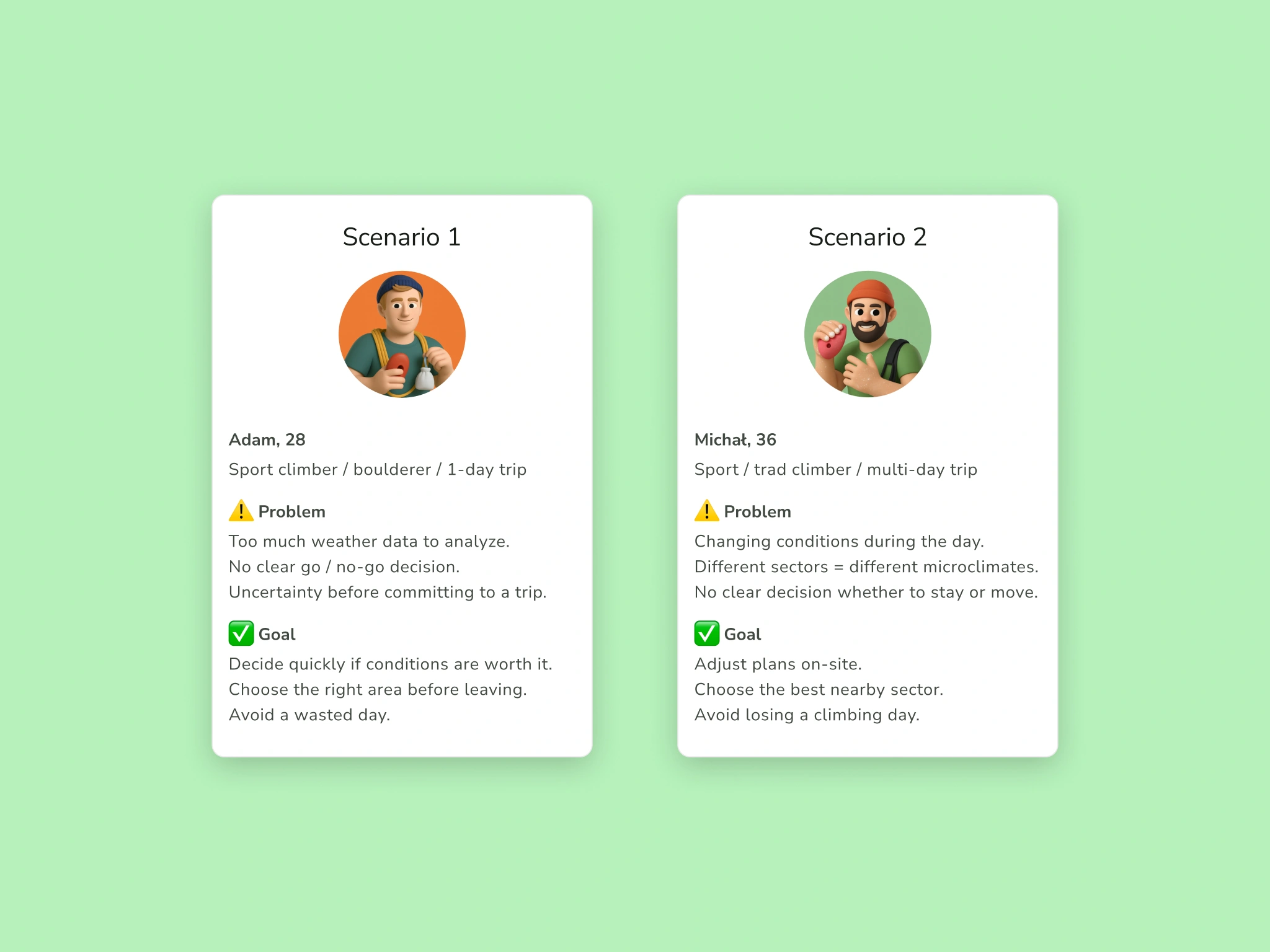
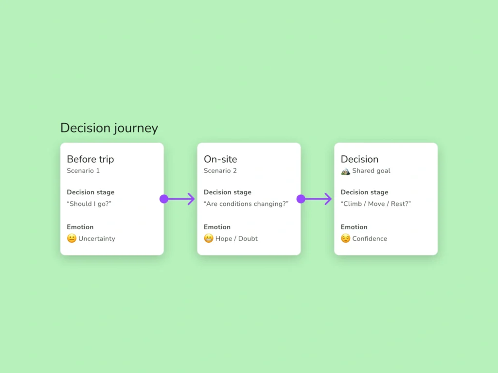
Climbers make highly context-dependent decisions. Some plan short trips and need a fast go/no-go answer. Others are already on-site and must dynamically adjust to changing microclimates.
The challenge was not to provide more data, but to reduce cognitive load and support confident decision-making in both contexts.
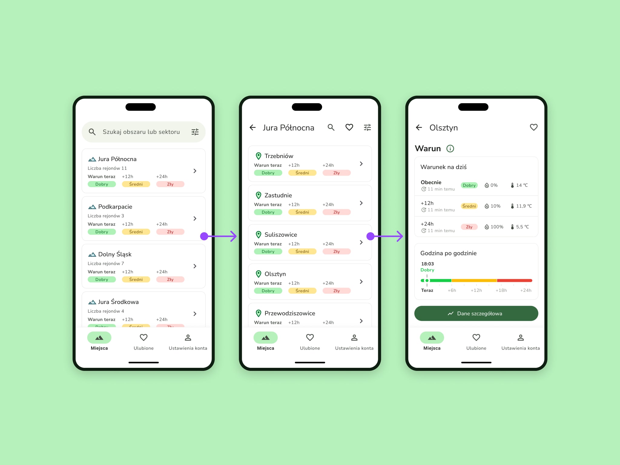
One major difficulty was structuring location data into two intuitive levels — areas and sectors — while maintaining fast search and exploration. I designed a split-list navigation pattern to reduce friction and improve scanning.
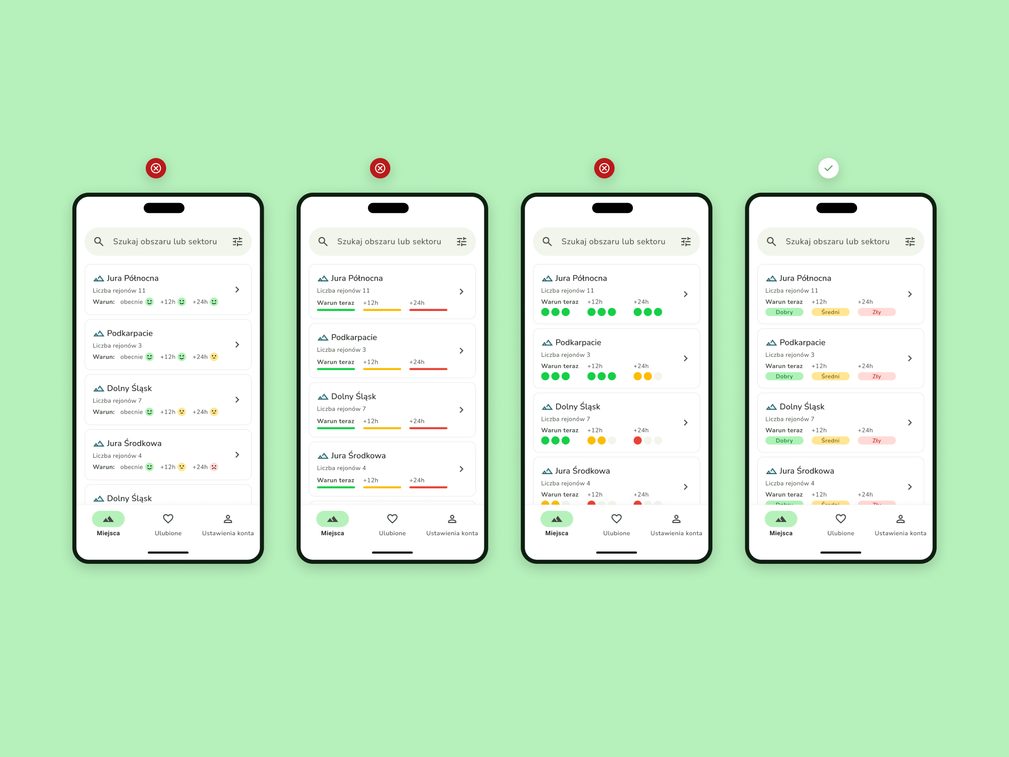
Another challenge was presenting dynamic hourly forecasts within limited screen space. This was solved through compact, color-coded components and a consistent layout system prioritising readability over density.
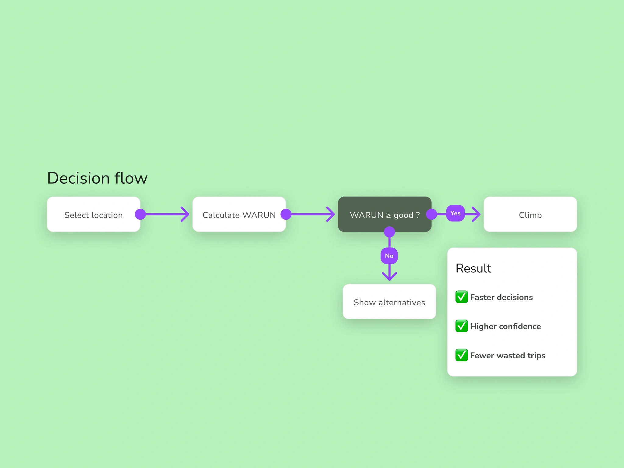
Beyond interface structure, I also needed to clarify the product’s decision logic. Instead of exposing raw weather parameters, the system translates multiple variables into a single condition indicator. This required defining a clear decision threshold — when WARUN is “good enough” — and designing alternative paths when conditions are not optimal, helping users move from uncertainty to action.
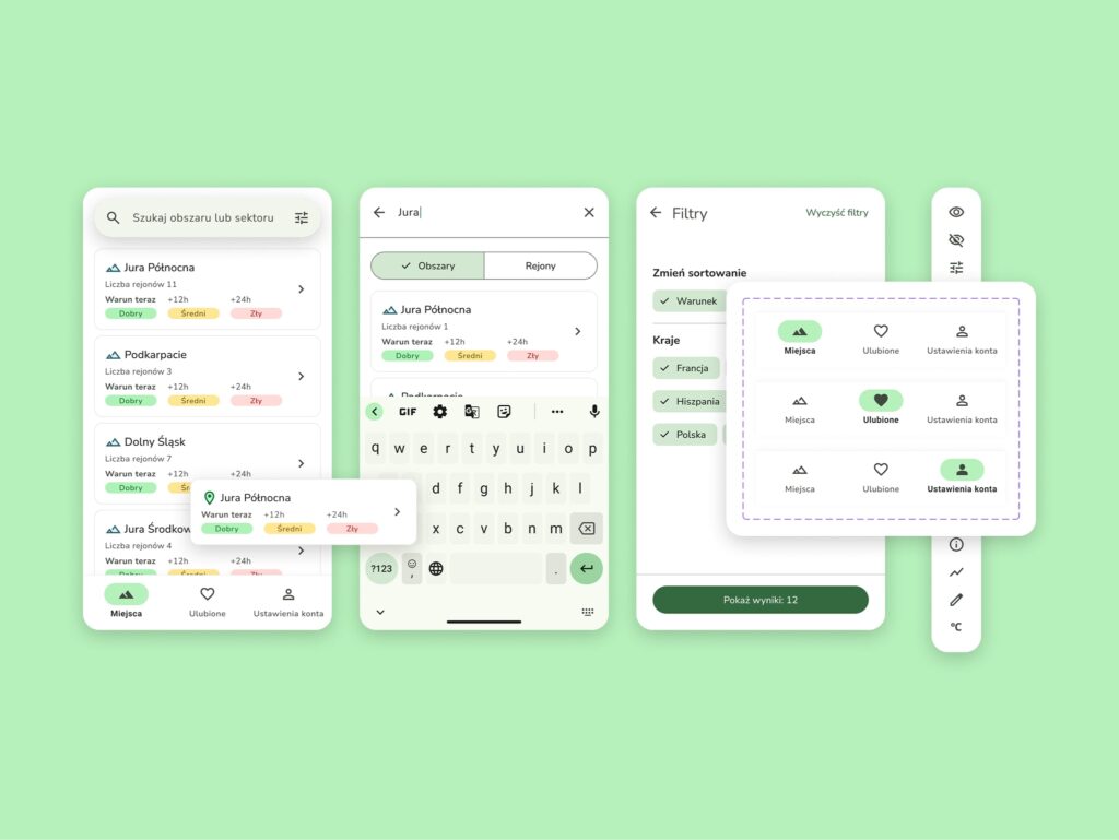
The interface was built on a modified Material Design system to accelerate development and reduce implementation costs. Leveraging an established component logic allowed us to maintain consistency while minimising custom UI complexity.
Given limited development capacity, features were prioritised carefully and some were intentionally postponed to ship a stable and focused MVP.
All major changes were validated with active climbers and testers, including real-world testing during climbing trips. The condition representation went through several iterations before reaching a clear and intuitive format.
User feedback consistently confirmed reduced time spent analysing weather data and increased confidence in decision-making.
The application is live and available in the Google Play Store in a testable version. It continues to evolve iteratively, with features refined through user feedback and agile development cycles.