In progress
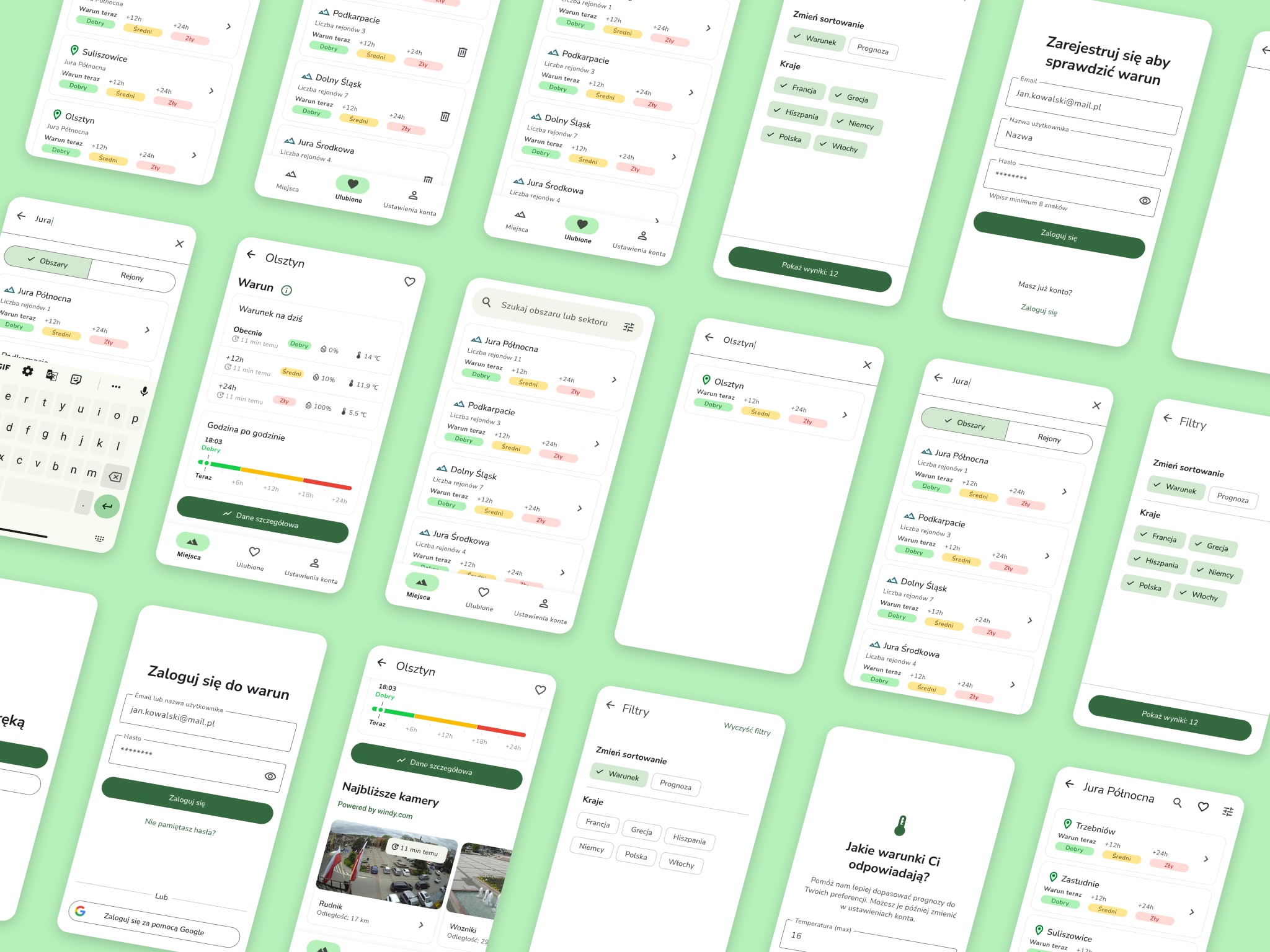
Warun
Smart forecasts for better climbing
A digital therapy platform focused on clarity and user trust
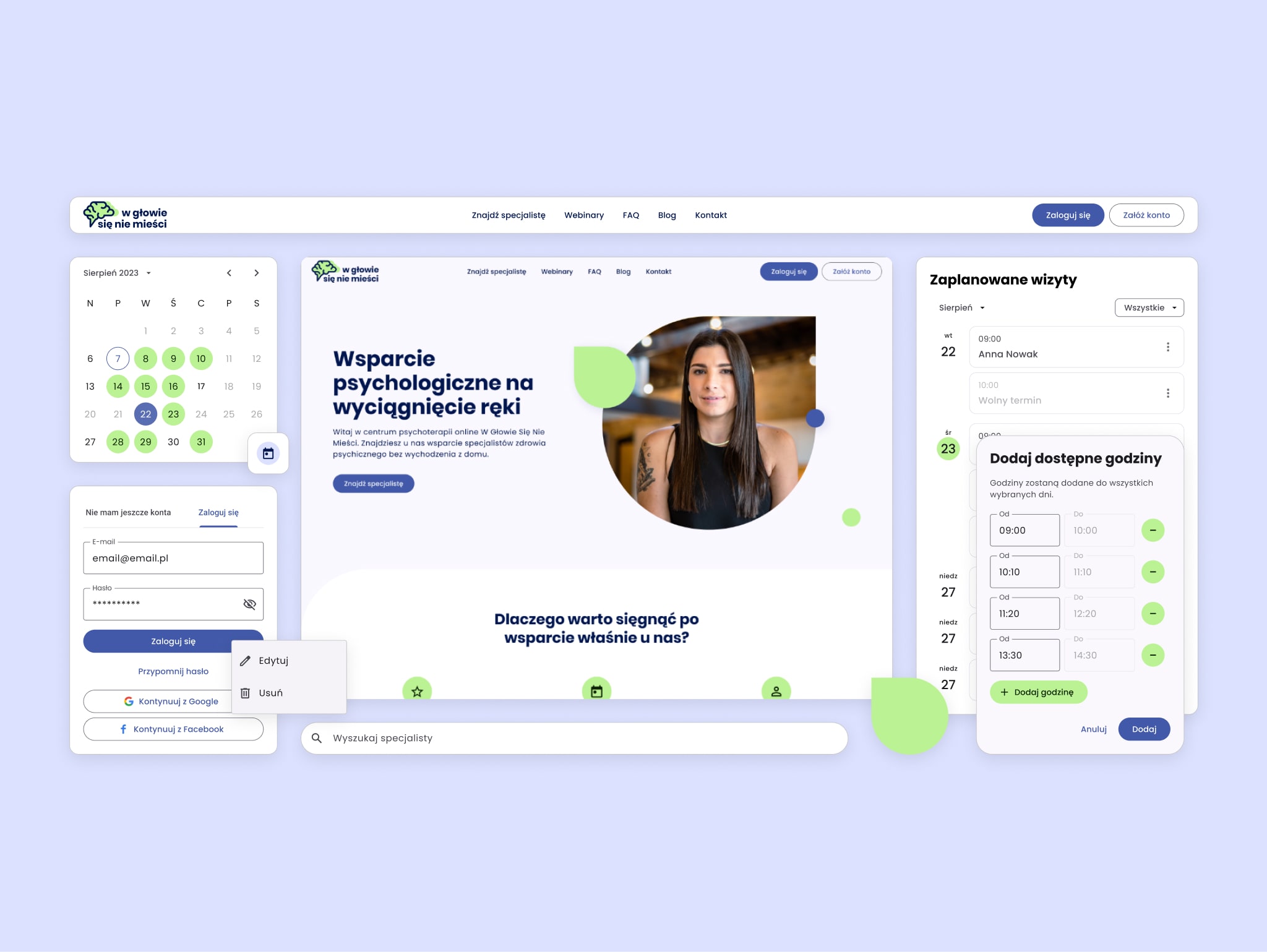
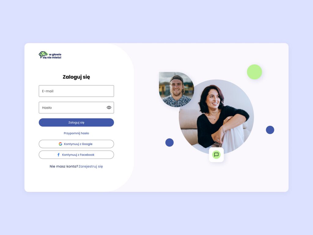
“W głowie się nie mieści” is an online therapy platform created to connect people in need of mental health support with qualified professionals. My role as UX/UI designer was to shape the end-to-end experience – from information architecture and user journeys to the visual system and brand identity.
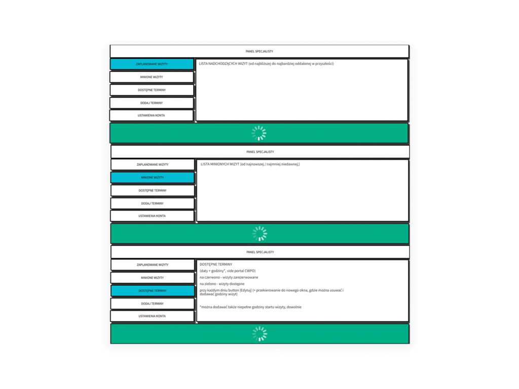
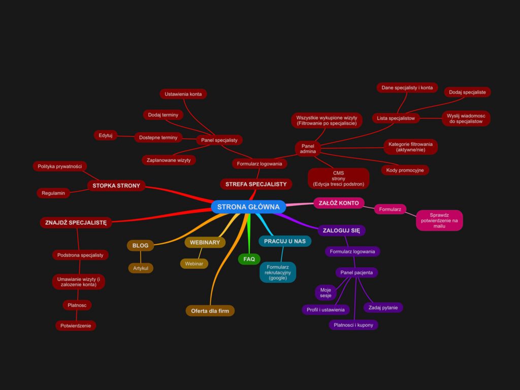
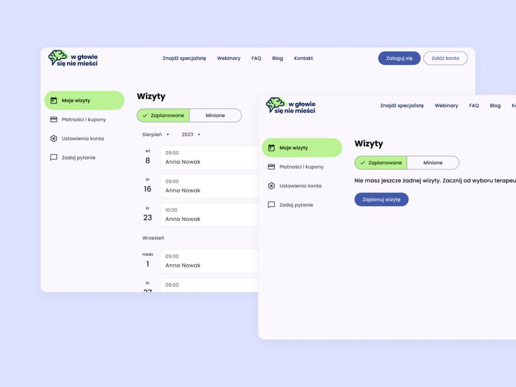
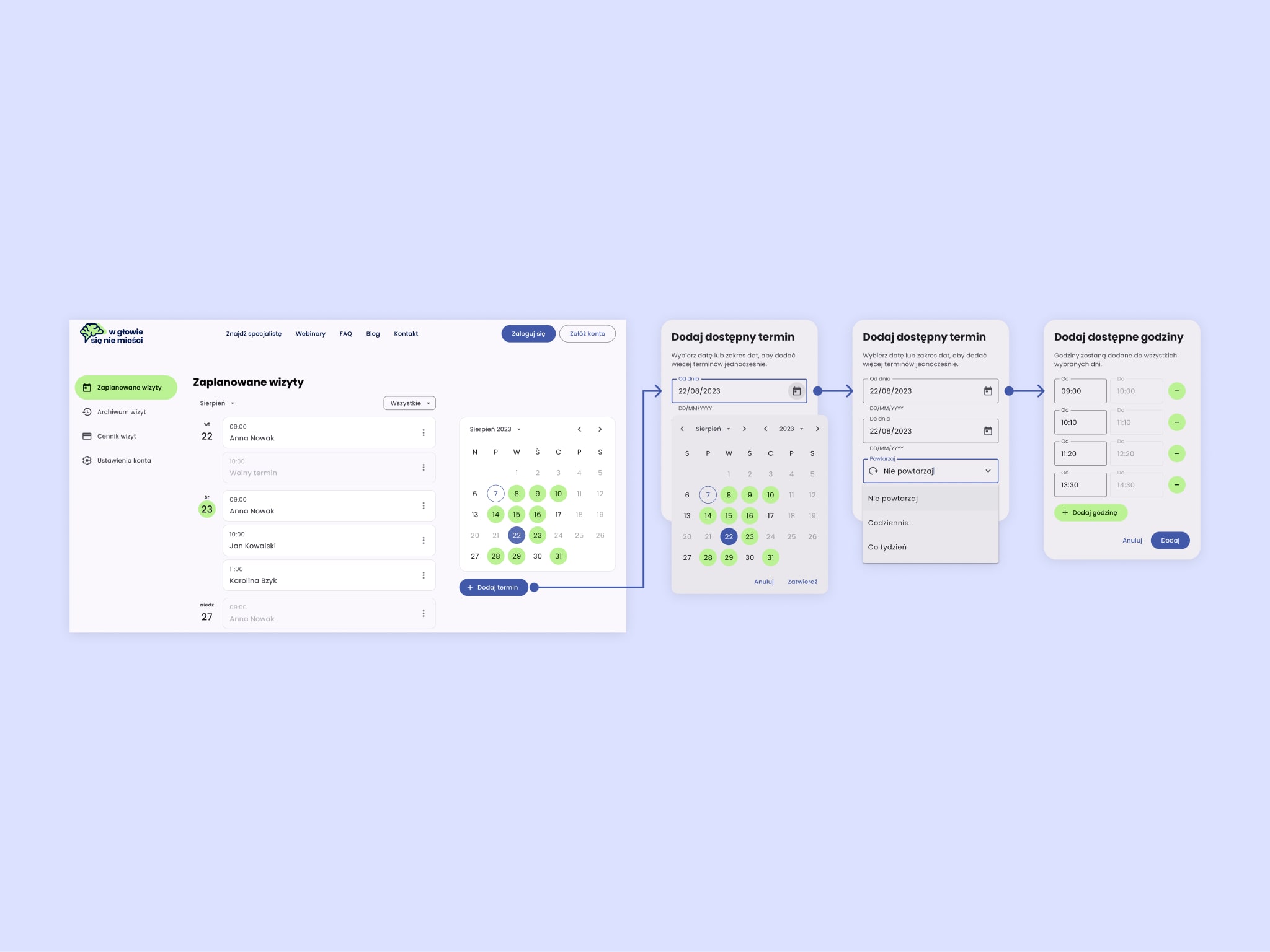
The platform was built around two main user journeys — for clients and therapists — sharing a unified visual and functional foundation. For clients, I designed a seamless flow covering login, profile setup, therapist search, filtering by therapeutic methods or availability, and booking appointments. On the therapist side, I developed a scheduling system that allowed practitioners to manage session times and availability with ease.
To accelerate delivery and reduce complexity, we based the project on a customized Material Design system — ensuring faster implementation and smoother handoff for developers.
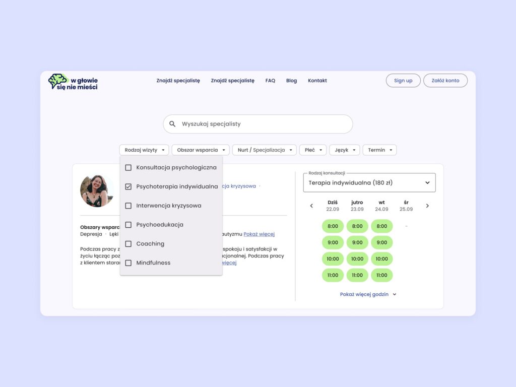
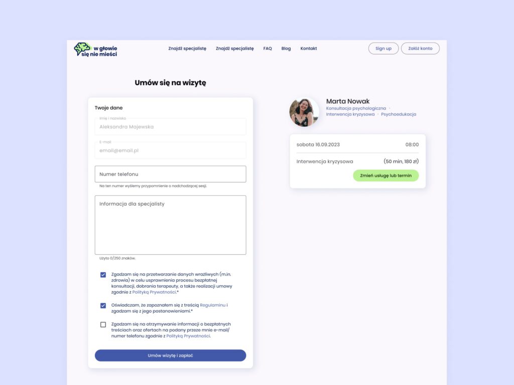
We began with user interviews, including therapists familiar with other platforms. Their feedback helped us identify real pain points — such as unclear availability, limited filtering options, and confusing flows.
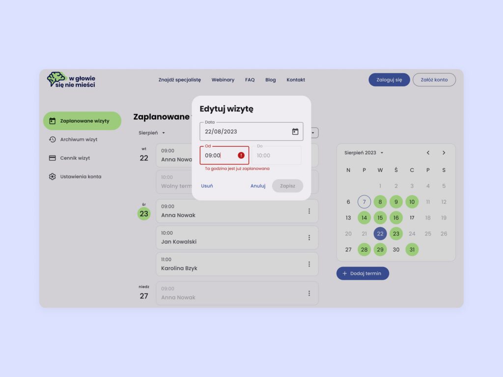
One of the biggest UX challenges was designing the shared session calendar system for both clients and therapists. Our goal was to standardize as many interface elements as possible, which allowed for faster iteration and consistent experiences across user types.
I led the structuring of the interface and labeling system, advocating for a clearer, more inclusive language across forms, buttons, and notifications. While marketing copy was handled by another team member, I ensured that all interface content remained emotionally neutral and user-friendly — aligned with the platform’s supportive tone.
The design was fully responsive and optimized from the start for mobile use.
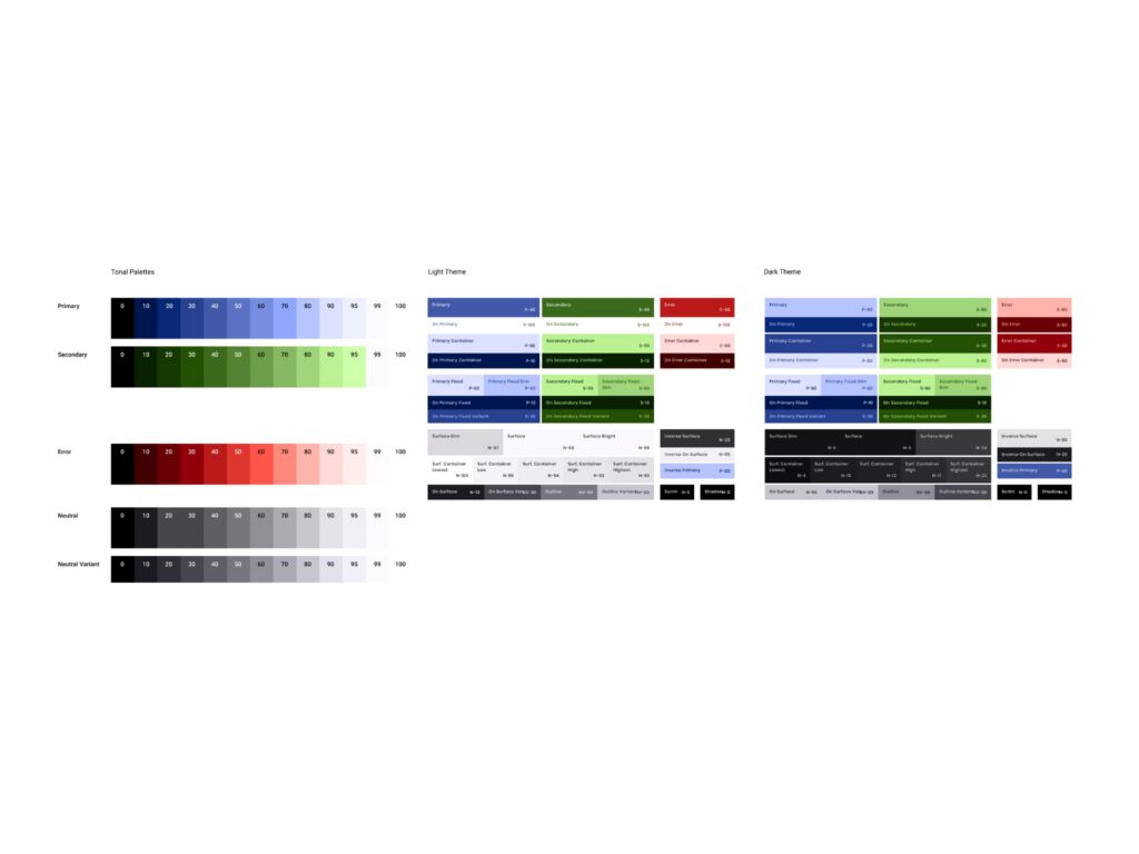
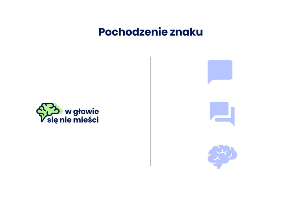
I also created the project’s visual identity, including the logo — a symbol combining references to a brain, a speech bubble, and a sense of “something that doesn’t fit in your head.” I developed the full color palette, type system, and visual tone to reflect the brand’s calm and approachable personality.
The project was completed by a small team and delivered efficiently thanks to smart design system choices and a focused UX process. The platform launched with a cohesive structure, strong visual clarity, and intuitive flows, providing a solid foundation for continued use and future feature expansion.